
I checked in early for my flight from LA to Tokyo so I have a couple extra hours to show you some of my sketches. There aren't really words to explain how much my three months in the USA and Canada have opened my eyes to the world of creativity and travel. I whole heartedly recommend any young creative person to see the world before they start any sort of serious work. It completely changes your perspective and you definitely adopt a more positive and excited outlook on the world. This totally reflects in the work you produce also.
I bought a new sketchbook in Brooklyn, New York. Definitely my kind of town. The food's incredible, the people inspired and location is sublime.

I spent several hours on the Subway, an essential New York experience. These trips made me think a lot about the future for the Melburbia series, it was great to see so many diverse and expressive characters all around me. There was one trip I took to Manhattan and the carriage was packed. Nevertheless, there was one young woman reciting her poem at one end and a barbershop quartet on the other. An overload of delightful proportions


It was great to find quiet spots in such a busy city. The above sketch was done in MoMA, I sat in this spot for a good hour or so. This fountain exhibit was so calming, the room was filled with Turkish rugs and lit so dimly. I think I have some future home ideas.

A lot of the time was spent in my own head. If I didn't feel up to drawing what was around me, I drew what was in my mind. You definitely find out a lot about yourself when you spend that much time drawing. I'm not sure what exactly sure what I found out from these drawings but I'll let you know when I do.


I drew the above piece when I dropped and lost my credit card in Times Square. I like to think I'm a smart traveler but when you do something like lose a piece of plastic, it gets to you. Visa were super helpful with the replacement card but the whole ordeal is definitely more trouble than it's worth.


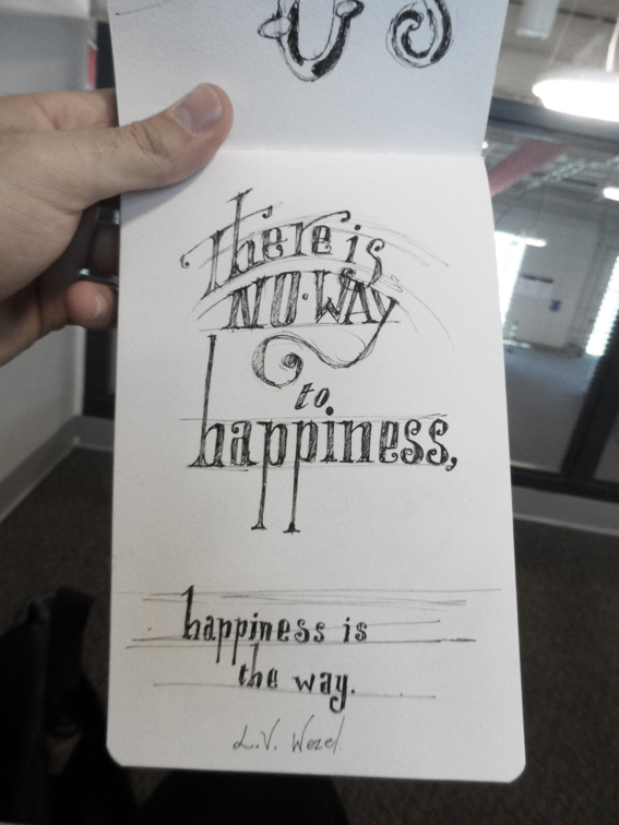
The above mantra was said to me by the happiest man I've ever met. This was the last thing he said to me before I left San Diego in July. I can't think of anything truer. You can't wait for happiness to come to you, it's a state of mind that only you can achieve whenever you want it. So go grab it.
I'll be in Japan next time you hear from me, I'm so excited :)
All the best,
Mete.


