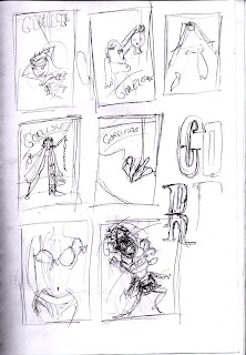
When you receive a brief that starts with this, '[Gorelesque] is burlesque with influences of the bizarre, horror, gore, and that based in fetish', it's very hard to say no. The client wanted a poster for her show 'Gorelesque 2' that drew from the above description. She also mentioned that it needed classic shlock horror film references (Dracula, Frankenstein) but also modern (House of 1000 Corpses and Dawn of the Dead). This was more than enough for me to go with.
However, as you can see from the above thumbnails, there were so many interesting directions I could go with that it became a challenge to decide which one I liked most. This is what I originally came up with. Blaaghhh.
This girl is meant to be strapped to an electric chair with leather straps wrapped around her body. I wanted to add a bird's eye perspective but it just appeared out of proportion and, in the end, heavily laboured. So I scrapped it. I drew about 4 more images similar to this, each one more wonky than the other. I went back to research and found Brandon Ragnar Johnson to be of some assistance. His work was perfect inspiration for where I wanted to take this. He has an amazing sexy, zany yet dark style but with hints of 1950's pinup. This is what I came up with.
A sadistic Bride of Frankenstein with her decapitated husband's head. You'll see much more blood later on. This was perfect as she acts as an empowering female figure in classic horror although she may be under appreciated. Perfect motive for such an act of oh so sexy cruelty. I made some slight changes to the pose based on my illustration tutor's feedback and was good to go. I also did the type for the poster's title, 'Gorelesque', the '2' came later.
I wanted that sideshow, almost circus-gone-wrong image, here's the finished title.
And this is my stunning bride of Frankenstein all bloodied up and beautiful. I had tiny bits of Tarantino in mind.
As this was a poster, I wanted to keep the colour range tight (Green, yellow and red), it makes the image more punchy. I find that when my colour palette is too wide, I lose control over it. Here's the final composition before the body text was added,
The relationship between image and typography turned out as well as I had hoped. They marry up really well. And it relates back to the initial description of Gorelesque, 'burlesque with influences of the bizarre, horror, gore, and that based in fetish'. I mean, can't you just see her licking the blood off the cleaver? By the way it absolutely had to be a meat cleaver, I can't think of a more barbaric kitchen utensil other than a blender perhaps.
This is what I sent to the client and she was pretty happy. At the moment, we're working on print production.
Cheers.
Thursday, June 17, 2010
Wednesday, June 2, 2010
Sax Genie
Ever get the feeling you're trapped in a jazzy cigarette? This guy does. The title of this brief was simply 'Fashion Victim'. Before I received the brief, I had this doodle scribbled in my sketchpad while I was on the train.
You can see the cigarette was vaguely scribbled as an afterthought. When I looked though my sketchpad for ideas about fashion victims, I thought this guy could be useful. So I developed him a bit more.
So the concept was there but the zazz and style wasn't. He's clutching the sax instead of letting his fingers dance on it. And the flow motion isn't exaggerated enough. You can see that I started on making his head bigger. I came up with this, which I was way happier about.
He's a lot more in the moment, the flow of his smokey tail is getting there a bit more but can still be pushed. I was really happy with the hands here also, I took inspiration from James Hewitt's 'Gorillaz' Illustrations in that department.
So here's the first version of the final product. It's moody and cool, you can almost hear that breathy sax. The textures are working well, they add to the seediness that comes from living a cigarette. The stubble texture is a personal favorite of mine. I wasn't too sure about the ash tray, it was becoming too much of a feature in the image when really I just wanted a home for the cigarette. It was hard to see on its own. The tie's floating with the smoke rather than being stapled down to the shirt as well. The tail's got nice flow but it can be better. I looked back at the old Disney VHS's and wow, the animation on genie is insane. Just check out the way his slides and moves so smoothly like smoke.
Anyway, when I printed it out, I completely lost the contrast between the dark blue and the black, it just looked like little bit of light blue and white popping out of darkness. As a result, I made the background a healthy nicotine yellow. So here we have it, my sax genie, stuck in his jazzy cigarette for an eternity. Maybe someone will smoke him and they'll get three stinky wishes.
Smoking kills, kids.
Subscribe to:
Comments (Atom)


