Tuesday, September 28, 2010

Glass Half Full

Hi guys, it's been a busy semester, hence the length of time between this post and my last. I'm going through the last few weeks of my degree so it's great to take a week off and recoup. There's a couple of projects I'd really love to show but haven't been returned from assessment yet. 

Below we have my entry for the Positive Posters competition, this year's theme was 'glass half full'. Unfortunately this didn't get shortlisted but I still think it's worth showing. The concept's simple, take a crappy day and find a glimmer of light within it.


In hindsight, I prefer the sketch to the final product.

This illustration, I feel, would work better for an editorial article rather than a poster.

So I'll hang on to it for a rainy day.

Yeah I went there.

Cheers!

Sunday, August 8, 2010

Ice Ice Baby

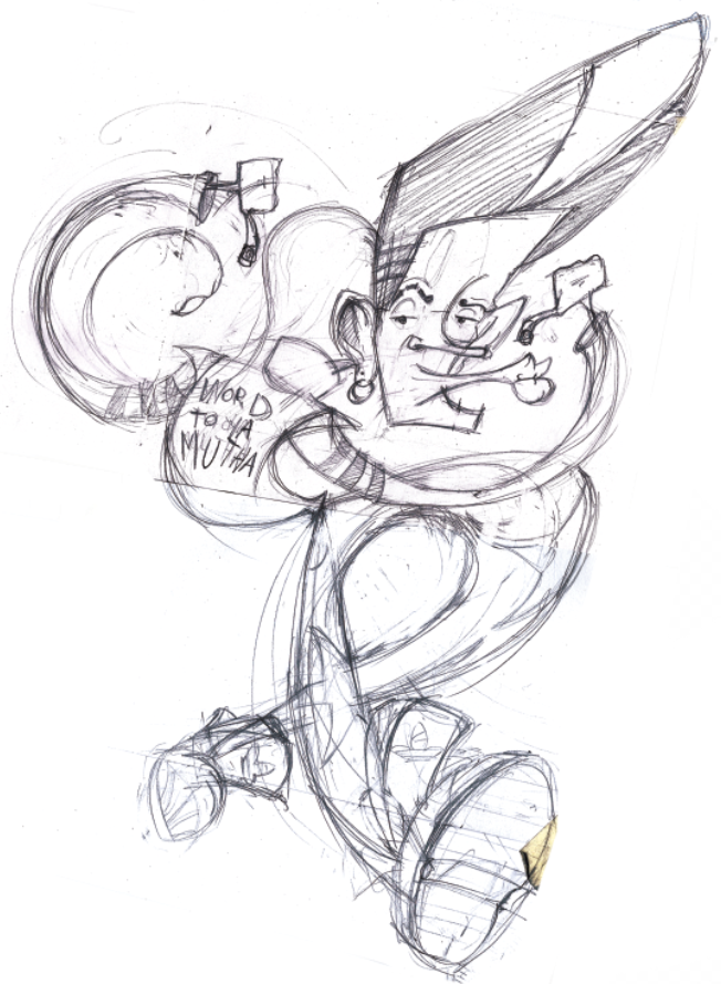
This month, Monash uni student mag 'esperanto' published another triumphant issue, back to the 90's. When asking how I could be involved, Josh (Art Director) gave me three options. I could do an illustration for the Spice Girls, Captain Planet or Vanilla Ice. For me, Mr. Van Winkle was the obvious choice. Better still, the article itself canned him like crazy. Although I felt a little sympathy for the guy, I felt it was my duty to compliment the insult. Here is the initial sketch I sent in before we went on.


It worked so we went with it. Josh encouraged the use of Red, black and white as those three colours ran consistent through the issue. I respect his thoroughness. So this is the spread.


If you're on campus, be sure to pick one up. Not just for the Van Winkle article but also 'Afternoon Delight', it walks us through some of the most kick ass cartoons of the 90's and another one on how the guys from Oasis are dicks. Good read.

Thanks to 'esperanto' for allowing me to get involved, these guys are always after contributors so be sure to give them a holler.

Sunday, August 1, 2010

Lion Pie

24 hours to make a poster that'll represent the image of an entire company's launch party. Sure, why not. Lion Pie is a Sydney based initiative developed by a group of fresh NIDA graduates. Its aim is to bring artists, actors, authors and industry professionals together to showcase their current projects. The poster needed to symbolise the 'work in progress' nature of the event as well as the young energy flying around when new ideas are being created. While being briefed over the phone, I scribbled a few brainstorms and notes. The call was conveniently made when I was just about to rush out the door, this is what it looks like with a nice acid yellow overlay.


I eventually figured that this could be the base of the final design. It's rushed, raw and puts my personal thoughts out there in a gutsy way, god I'm brave. But that's what Lion Pie is all about, being confident and biting off more than you can chew. So here's the final poster,


I wanted to maintain as many hand drawn elements as possible to maintain the rawness. It was also quicker to put together. So from the above design, everything else came more naturally, the invitation and the sponsor document. Luckily, I had an awesome client who was really clear about what she wanted but was open to interpretation. When she said she wanted the invitation text to look like it was stamped in a conveyor belt, I generally got what she meant.


The sponsorship document was slightly more corporate purely for readability reasons but still had the Lion Pie vibe about it. It was a simple double sided folded A4 document handed out to visitors and potential sponsors at the launch party. This was the first time I've seen people take my design home with them, a surreal experience but reaffirming.


Like the violin guy? :P Also, 6 pieces of my work were selected to actually exhibit at the event,


Overall, a hugely positive experience I won't soon forget. Massive thanks to the Lion Pie Crew for allowing me to be a part of it and putting together such a kickass launch party and to my cousin Kemal and his family for their hospitality and support. The Lion Pie website's definitely worth checking out www.lionpie.com as is Kemal's t-shirt brand, Stunna Shade Boyz http://www.facebook.com/pages/Stunna-Shade-Boyz

Peace.

Thursday, July 8, 2010

Sky Airways

The challenge, breathe life into a corporate document, an annual report. Choose whatever company you desire and then change their name and style to suit your own. My choice was the Emirates Airline 2009 annual report, I changed the name to Sky Airways. The brief was to create a 21 page document of prefect typesetting and info graphic material (pie charts, graphs, tables etc)

The design style was to reflect the nature of the data so if it was a good year, you'd make somethign with gold medals or something. A bad year, maybe a Gothic cemetery. From my observations, the demand of Emirates' service went down while fuel prices went up (this was during the global financial crisis last year). However, their strongest aspect ever in the history of the company was its customer service. This took me back to the 60's where airline service was at its peak.


Beautiful aren't they? And just look at those pastels. I wanted to create something with three base colours and run them throughout the report, this would tie the whole thing together nicely.

However, no airline wants to appear outdated, so I looked at where this style of art has gone. THe 'Catch me if you Can' opening credits were a perfect place to look.


This animation from Nexus Productions uses collage in such a beautiful way. The textures flicker around the characters gving them een more personality.

The Style was set, now I needed to look at info graphic design. There was tonnes.


This was  a massive leap forward. When I had all these lined up,  I drew up a storyboard

And got cracking. This is a sample of my Sky Airways Annual Report.


Happy flying.


Thursday, June 17, 2010

Gorelesque 2

When you receive a brief that starts with this, '[Gorelesque] is burlesque with influences of the bizarre, horror, gore, and that based in fetish', it's very hard to say no. The client wanted a poster for her show 'Gorelesque 2'  that drew from the above description. She also mentioned that it needed classic shlock horror film references (Dracula, Frankenstein) but also modern (House of 1000 Corpses and Dawn of the Dead). This was more than enough for me to go with.


However, as you can see from the above thumbnails, there were so many interesting directions I could go with that it became a challenge to decide which one I liked most. This is what I originally came up with. Blaaghhh.


This girl is meant to be strapped to an electric chair with leather straps wrapped around her body. I wanted to add a bird's eye perspective but it just appeared out of proportion and, in the end, heavily laboured. So I scrapped it. I drew about 4 more images similar to this, each one more wonky than the other. I went back to research and found Brandon Ragnar Johnson to be of some assistance. His work was perfect inspiration for where I wanted to take this. He has an amazing sexy, zany yet dark style but with hints of 1950's pinup. This is what I came up with.


A sadistic Bride of Frankenstein with her decapitated husband's head. You'll see much more blood later on. This was perfect as she acts as an empowering female figure in classic horror although she may be under appreciated. Perfect motive for such an act of oh so sexy cruelty. I made some slight changes to the pose based on my illustration tutor's feedback and was good to go. I also did the type for the poster's title, 'Gorelesque', the '2' came later.


I wanted that sideshow, almost circus-gone-wrong image, here's the finished title.


And this is my stunning bride of Frankenstein all bloodied up and beautiful. I had tiny bits of Tarantino in mind.


As this was a poster, I wanted to keep the colour range tight (Green, yellow and red), it makes the image more punchy. I find that when my colour palette is too wide, I lose control over it. Here's the final composition before the body text was added,


The relationship between image and typography turned out as well as I had hoped. They marry up really well. And it relates back to the initial description of Gorelesque, 'burlesque with influences of the bizarre, horror, gore, and that based in fetish'. I mean, can't you just see her licking the blood off the cleaver? By the way it absolutely had to be a meat cleaver, I can't think of a more barbaric kitchen utensil other than a blender perhaps.


This is what I sent to the client and she was pretty happy. At the moment, we're working on print production.

Cheers.

Wednesday, June 2, 2010

Sax Genie

Ever get the feeling you're trapped in a jazzy cigarette? This guy does. The title of this brief was simply 'Fashion Victim'. Before I received the brief, I had this doodle scribbled in my sketchpad while I was on the train.


You can see the cigarette was vaguely scribbled as an afterthought. When I looked though my sketchpad for ideas about fashion victims, I thought this guy could be useful. So I developed him a bit more.


So the concept was there but the zazz and style wasn't. He's clutching the sax instead of letting his fingers dance on it. And the flow motion isn't exaggerated enough. You can see that I started on making his head bigger. I came up with this, which I was way happier about.


He's a lot more in the moment, the flow of his smokey tail is getting there a bit more but can still be pushed. I was really happy with the hands here also, I took inspiration from James Hewitt's 'Gorillaz' Illustrations in that department.


So here's the first version of the final product. It's moody and cool, you can almost hear that breathy sax. The textures are working well, they add to the seediness that comes from living a cigarette. The stubble texture is a personal favorite of mine. I wasn't too sure about the ash tray, it was becoming too much of a feature in the image when really I just wanted a home for the cigarette. It was hard to see on its own. The tie's floating with the smoke rather than being stapled down to the shirt as well. The tail's got nice flow but it can be better. I looked back at the old Disney VHS's and wow, the animation on genie is insane. Just check out the way his slides and moves so smoothly like smoke.


Anyway, when I printed it out, I completely lost the contrast between the dark blue and the black, it just looked like little bit of light blue and white popping out of darkness. As a result, I made the background a healthy nicotine yellow. So here we have it, my sax genie, stuck in his jazzy cigarette for an eternity. Maybe someone will smoke him and they'll get three stinky wishes. 


Smoking kills, kids.

Tuesday, May 25, 2010

Be the person your dog thinks you are

It was a week after this brief was given and  I still had no idea what to do. The task was to find a quote and do an illustration inspired by it. I scoured the internet in searching nothing appealed to me. It wasn't until I was sitting at Balaclava station that I found this on the wall.


I loved it so I went with it. A dog would exaggerate everything, including how awesome you are. Let's face it, the dog doesn't know you didn't hunt down what's in those shopping bags. So that was the premise of my idea, 'Be awesome'. This was my first doodle,


Admittedly, it lacked awesomeness. So I needed to find some amazing people to give me some visual queues. I knew just the guys,


And so came my concerning vision of what I felt their lovechild would look like.


The sketch eventually worked for me and here's the final product. A rugged, gleaming Fabio Norris-He-Man bringing the dog's feast home in all its glory.

 Enjoy.