The design style was to reflect the nature of the data so if it was a good year, you'd make somethign with gold medals or something. A bad year, maybe a Gothic cemetery. From my observations, the demand of Emirates' service went down while fuel prices went up (this was during the global financial crisis last year). However, their strongest aspect ever in the history of the company was its customer service. This took me back to the 60's where airline service was at its peak.
Beautiful aren't they? And just look at those pastels. I wanted to create something with three base colours and run them throughout the report, this would tie the whole thing together nicely.
However, no airline wants to appear outdated, so I looked at where this style of art has gone. THe 'Catch me if you Can' opening credits were a perfect place to look.
This animation from Nexus Productions uses collage in such a beautiful way. The textures flicker around the characters gving them een more personality.
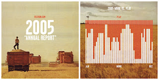
The Style was set, now I needed to look at info graphic design. There was tonnes.
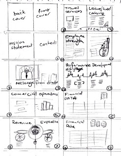
This was a massive leap forward. When I had all these lined up, I drew up a storyboard
And got cracking. This is a sample of my Sky Airways Annual Report.
Happy flying.


wow! i love the first spread - mission and contents. really striking and immediately engages the reader.
ReplyDeleteI am so jealous of the work you do! Tara
ReplyDeleteDon't be :P I can bring this to Forethought.
ReplyDelete