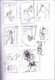
When you receive a brief that starts with this, '[Gorelesque] is burlesque with influences of the bizarre, horror, gore, and that based in fetish', it's very hard to say no. The client wanted a poster for her show 'Gorelesque 2' that drew from the above description. She also mentioned that it needed classic shlock horror film references (Dracula, Frankenstein) but also modern (House of 1000 Corpses and Dawn of the Dead). This was more than enough for me to go with.
However, as you can see from the above thumbnails, there were so many interesting directions I could go with that it became a challenge to decide which one I liked most. This is what I originally came up with. Blaaghhh.
This girl is meant to be strapped to an electric chair with leather straps wrapped around her body. I wanted to add a bird's eye perspective but it just appeared out of proportion and, in the end, heavily laboured. So I scrapped it. I drew about 4 more images similar to this, each one more wonky than the other. I went back to research and found Brandon Ragnar Johnson to be of some assistance. His work was perfect inspiration for where I wanted to take this. He has an amazing sexy, zany yet dark style but with hints of 1950's pinup. This is what I came up with.
A sadistic Bride of Frankenstein with her decapitated husband's head. You'll see much more blood later on. This was perfect as she acts as an empowering female figure in classic horror although she may be under appreciated. Perfect motive for such an act of oh so sexy cruelty. I made some slight changes to the pose based on my illustration tutor's feedback and was good to go. I also did the type for the poster's title, 'Gorelesque', the '2' came later.
I wanted that sideshow, almost circus-gone-wrong image, here's the finished title.
And this is my stunning bride of Frankenstein all bloodied up and beautiful. I had tiny bits of Tarantino in mind.
As this was a poster, I wanted to keep the colour range tight (Green, yellow and red), it makes the image more punchy. I find that when my colour palette is too wide, I lose control over it. Here's the final composition before the body text was added,
The relationship between image and typography turned out as well as I had hoped. They marry up really well. And it relates back to the initial description of Gorelesque, 'burlesque with influences of the bizarre, horror, gore, and that based in fetish'. I mean, can't you just see her licking the blood off the cleaver? By the way it absolutely had to be a meat cleaver, I can't think of a more barbaric kitchen utensil other than a blender perhaps.
This is what I sent to the client and she was pretty happy. At the moment, we're working on print production.
Cheers.


I always enjoy reading your posts and particularly your thoughts on the whole process. The end result is awesome and I love the type of the title. m
ReplyDeleteOH MY GOSH mete, amazing work! tallented as. are you going to the show?
ReplyDeletecara cornelissen.
Yeahh definitely going, never seen anything like it. You going too?
ReplyDelete