Monday, July 9, 2012

Wexford EP Launch

I write to you tonight on the living room couch I will call my bed for the next couple weeks. I've moved out of my rental but my beautiful housemates have made me welcome to stay over any time. I turned the ripe age of twenty four yesterday and the scar on my back from minor surgery is a humble reminder that I'm doing absolutely fine. Only fourteen days remain until my 11am flight departs from Melbourne's Tullamarine airport bound for the USA. I'll spend three months traveling along the East and West coastlines before I spend an additional two months in planet Japan. Needless to say, life's been an incredible ride lately and it seems that the insanity is just beginning.

Part of my USA trip will be spent at the anticipated Outside Lands music, beer, wine art and food festival. Somehow, someone out there decided to combine my favourite things into a tightly packaged three day celebration. Thank you kindly sir(s)/madams(s). Music has always been a massive inspiration for me, so whenever a musician approaches me for a collaborative venture, I'm in.

The lucrative Tom Carty has started a new pop act called 'Wexford'. He combines the smooth tones of Jason Mraz with sweet melodies of Bruno Mars. I created his logo and EP launch poster. Below, we have the logo options. His music has a naive approach to love and having a crush but the sound is still quite polished and refined. As a result, I wanted a nicely structured piece of hand generated type. The options are below:


After about week of discussion and back and forth. We came up with a hybrid of option one and three. I'm pretty keen on it.


Then, we started work on the poster, I gave him two initial ideas, shown below:


The loose colour pencil sketches were inspired by James Jean's moleskine sketch series; it's truly sublime, definitely take a look. Tom and his manager couldn't agree on which was more appropriate so I was asked to make a third option. I was was more than happy to do it, the colouring pencils were sitting on my desk ready to go. I came up with the third option below,


We all agreed on this one. It's free spirited, cute and fun. All I needed to do was beef up the typography...


...and we were all set. Check out the Wexford facebook page for gig details and maybe a signed photo of Tom if you're really nice.

On another note, this blog will be transforming into a hybrid travel/design blog for the next five months. I've seen design blogs and I've seen travel blogs. I figured I should just blow everyone's minds and do both in one.

Cheers,

Mete.

Tuesday, May 8, 2012

Mutation Theatre Identity

Mutation Theatre is one of Melbourne's most exciting experimental theatre companies. From translating Shaun Tan's 'The Arrival' in an immigration shed to backyard banter in a Fitzroy apartment, Mutation's founder Pat McCarthy is a true visionary. I was wrapped when he asked me to reinvigorate the Theatre Company's visual identity.

 The name 'Mutation' eventuated from the Theatre Company's constantly changing point of view so I wanted a logo that would swap and change. By definition, a mutation is the change in a DNA sequence, this feeds into the word 'mutant'... aww yeah :)

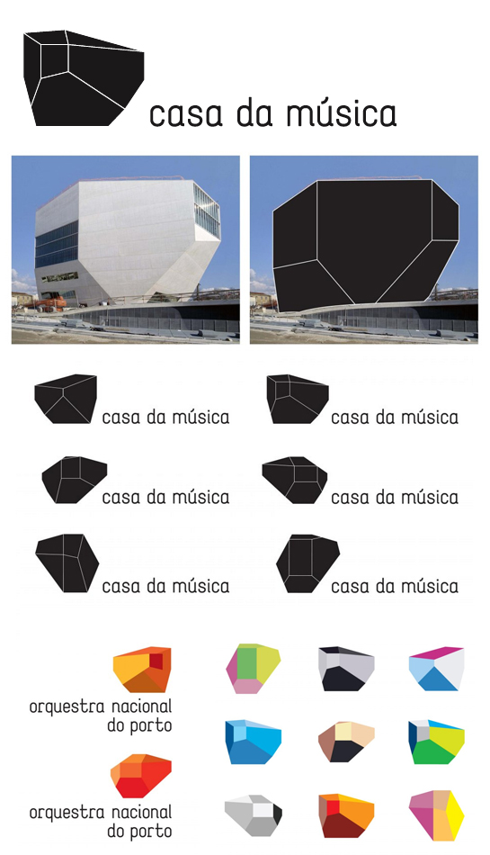
Stefan Sagmeister's 'Casa Da Musica' (House of Music) theatre logo is a great example of visual mutation. It mimics the 3D shape of the theatre itself and changes angle and colour for each performance.  See below,


With this in mind, I drew up two rough ideas. They both played with the idea of mutating light and characteristics. Both had this kaleidoscopic overlay which really excited me. Pat and I were keen to pursue the option on the right.
The triangular patterns relate to the three directions that light bounces in when it hits an uneven surface. Though the selected logo was good, it needed to be simpler, especially becuase it'd be thumbnail size a lot of the time. Keeping that in mind, I created the below concept.


The idea here is that the colour and photo change to suit every show. The blurry light spots are, again, a result of moisture hitting light and the camera's lens; mutation. The idea worked so he created  a default logo plus text only variation and another for Mutation's next show, 'Liberate Yourself From My Vice-Like Grip'.


Check out the The Mutation Theatre Blog, Facebook and Twitter. Definitely go see a show if you can, it'll change your view of entertainment entirely.

Cheers,

Mete.

Saturday, March 10, 2012

Bikefest: Chasing Rainbows Poster Competition

Salutations my friends,

 How's everyone going? I've been working on a few big projects at my casual office job which I'm super pumped about, but more about that in the near future. Today I'd like to share my entry for Bikefest's Chasing Rainbows Poster Competition. 

The brief was to create a poster for the '2012 UCI Track Cycling World Championships' with a vintage twist. The intention was to pay homage to the glory days of cycling posters. The late 1800s was an age of technological and human liberation. Printers were discovering lithographic printing techniques and the public developed a growing fascination with the newest piece of transport, the bicycle.

Some of my absolute favorites from this era are:

I see him as a pre Jamie Hewlett,


I love his shameless sense of luxury and excess


You guys know how I feel about flowy lines :-)
 So off I went with thumbnails. I arrived at the sketch below which I thought worked beautifully. The girl rides down a Melbourne street that mysteriously twists into an Olympic bike track. She exudes that subtle French style with the puffy sleeves, tutu skirt and the jaunty hat.


I thought it worked well so  I went in and coloured and shaded.


It looked good but something wasn't right. It wasn't working for me becuase there was no clear focal point; there's all this lovely stuff happening with the architecture and the dog in the apple crate. This illustration would probably work nicely as an editorial piece or part of a comic but there was no clear call to action.

I went back to the thumbnails and found this guy below. You might recognize him from my 'Importance of Being Earnest' piece. Though they look similar, he's more an adaptation of the style.

This Gentleman is a flaneur who cruises around Melbourne with his track bike/penny farthing hybrid. I wanted to capture the imagination, excitement and innovation of the late 1800's with this dandy, carefree traveler. The final image is below


I wanted the whole image to have that Beardsley flow which you can see in the tail of his jacket and tips of his fingers. I'm happy with this one, he looks like he's really having a awesome time. Anyway, I'll throw it over to you guys, what do you reckon?

And don't forget check out the submission gallery at The Melbourne Bikefest Website, Facebook and UCI Trackworlds 2012. There are some pretty amazing entries up.

Cheers,

Mete.


Thursday, March 1, 2012

Ayla's 21st

Hi guys, just a short one today.

My little sister Ayla's been bugging me for a couple weeks to do her 21st birthday party invitation. The theme is a 1960s cocktail party so she was super keen for a Mad Men vibe. I drew this one up and she got really excited about it.


Again, I've drawn inspiration from one of my favorite illustrators Arthur De Pins. His style captures a little bit of Ayla's flare and panache so we felt it was appropriate. She was really grateful through the process, she brought me Earl Grey tea and Ferrero Rocher chocolate at regular intervals of the process. We finished it in a few hours.


We'll print these on double sided A5s with the event info on the back. They'll make lovely keepsakes after what promises to be a truly splendid party.

If you would like an invitation, now would probably be a good time to suck up to Ayla.

See some of you there :)

Mete.

Sunday, February 12, 2012

Troubadour

Hey folks,

Happy new year! A lot has gone on since Melburbia; I've graduated with honours in Vis Com, been to Bali and back plus a few new and exciting jobs have been coming up. One of which I'd like to share with you today.

The Melbourne Comedy Festival's coming up and Asher Treleaven, one of the masterminds behind the lucrative Comic Strip, has a new show called Troubadour. Treleaven utilizes De Bono's six hats of thinking to answer the question 'is my life interesting enough to be an autobiography?'.

Asher was after a 60s vibe for the show's visual identity. We agreed the 'Catch Me If You Can' / 'Pink Panther' type of imagery would work well for the charmingly bizarre nature of his work. This gave me another excuse to peruse the work of some of my favourite 50s/60s inspired designers including Kuntzel+Deygas, Kevin Dart and Saul Bass (responsible for the design of many Hitchcock films).

After the self indulgence I call research, I presented Asher with two rough ideas:

The fist idea was a play on Saul Bass's work for 'The Human Factor'. The hanging phone had a sense of urgency to me, like user had heard something dramatically life changing and had to make a run for it. I liked the disorientation of it, slightly Pythonesque.


The second concept was inspired by an exhibition I saw in 2005, 'Andy Warhol Time Capsules'. The NGV displayed suitcases belonging to Warhol that contained small souvenirs of his life; Letters, records, shoes, films and so on. This was on the right track era and content-wise for the show so we went with it.


We made a few adjustments to colour and text but the concept ended up translating very well into print and screen.


The show is playing at the Town Hall from March 29 to April 22, Tuesdays to Sudays. Booking info is here.


I'll leave you with a word from the man himself.


Cheers,


Mete.


Sunday, December 11, 2011

Melburbia Is Complete!

Five months of research, three months drawing and one month of production. Melburbia was a grueling challenge of my patience and drawing skills. Looking back, of course I'm glad I did it but perhaps it was a little premature in the career timeline. I would have liked to do some more life drawing classes before creating the book; I felt like I was spending more time on getting the characters' bodies right than their performances.

The book itself came out beautifully. I set out to make a unique book that the owner would feel privileged to have. If you'd like to purchase the book, visit: http://metedesign.com.au/shop/

Huge thanks to everyone involved, whether you've read it, given feedback or followed the process. 


Where to from here? I'm looking to animate Melburbia. I just need to learn how to animate...

More soon!

Cheers,

Mete.

Thursday, September 8, 2011

Gorelesque 3: 2011 National Tour

I've always believed that three is the magic number. Mario jumps on Bowser three times to defeat him, the Genie grants three wishes and the unforgettable pop sensation Hanson was a trio. This year, Gorelesque 3 takes the show on the road visit Sydney, Adelaide and Melbourne; three brilliant locations. And this time, in 3D.

This year, we wanted a poster with an 80's cult horror film look. We checked out the classics like Nightmare on Elm St, Chopping Mall, Maniac and Silent Madness; they just don't make them like they used to:


We based the design on the below photo taken by Lights Camera Scream Photography:


After figuring out the look we were after, I generated these three (magic number) badboys to choose from:


Though they look similar, they're all based on different 80's cult horror film posters. We went with the first one. It was the darkest of the three so we could emphasize the 3D blue and red theme. Below is the final result.


Keep an eye out and definitely come see the shows; they're a scream.

Cheers,

Mete.

Sunday, September 4, 2011

Office interior design

Until this brief, the largest size I've worked with is an A0 sheet of paper. Forethought Research - the brilliant marketing research company I work for - commissioned me to design a pattern to coat nearly every plain of glass in their brand new office.

In a nutshell, Forethought gathers data on how the human mind responds to particular companies around the world. The data is used to measure public attitudes toward these companies. With this information, we work as a team to provide the client with positive ways of improving their business in the market.

This made me think of the parallels between Forethought's study of the brain and us as a team of people with unique skills (including marketing, consulting and design). I researched the human brain and the brief information I read blew me away.

I approached Forethought with this image,


These are brain neurons. Everything we do, feel and think starts with these guys. This complex network has been described as a play with no script or director; though the cast is completely chaotic, everyone miraculously knows their part. I decided to base the pattern on this; I proposed the below:

I received the thumbs up and after two months of liaising with the interior designers, working with floor plans and several trips to the construction site, we came out with the below result which I was thrilled about.


I also suggested that we covered the wall in the communal area with chalkboard paint so coworkers could visually communicate their ideas to one another in an informal, relaxed environment. Like Russel Crowe in 'A Beautiful Mind'. Without the hallucinations. We went ahead with this idea also. To welcome everyone to the new office on behalf of our management, I created the below piece; very much inspired by Dana Tanamachi 


I'm really excited about the fresh start and would also like to sincerely thank Forethought for giving me a go with this project. I really appreciate it.

Cheers,

Mete.