Sunday, December 11, 2011

Melburbia Is Complete!

Five months of research, three months drawing and one month of production. Melburbia was a grueling challenge of my patience and drawing skills. Looking back, of course I'm glad I did it but perhaps it was a little premature in the career timeline. I would have liked to do some more life drawing classes before creating the book; I felt like I was spending more time on getting the characters' bodies right than their performances.

The book itself came out beautifully. I set out to make a unique book that the owner would feel privileged to have. If you'd like to purchase the book, visit: http://metedesign.com.au/shop/

Huge thanks to everyone involved, whether you've read it, given feedback or followed the process. 


Where to from here? I'm looking to animate Melburbia. I just need to learn how to animate...

More soon!

Cheers,

Mete.

Thursday, September 8, 2011

Gorelesque 3: 2011 National Tour

I've always believed that three is the magic number. Mario jumps on Bowser three times to defeat him, the Genie grants three wishes and the unforgettable pop sensation Hanson was a trio. This year, Gorelesque 3 takes the show on the road visit Sydney, Adelaide and Melbourne; three brilliant locations. And this time, in 3D.

This year, we wanted a poster with an 80's cult horror film look. We checked out the classics like Nightmare on Elm St, Chopping Mall, Maniac and Silent Madness; they just don't make them like they used to:


We based the design on the below photo taken by Lights Camera Scream Photography:


After figuring out the look we were after, I generated these three (magic number) badboys to choose from:


Though they look similar, they're all based on different 80's cult horror film posters. We went with the first one. It was the darkest of the three so we could emphasize the 3D blue and red theme. Below is the final result.


Keep an eye out and definitely come see the shows; they're a scream.

Cheers,

Mete.

Sunday, September 4, 2011

Office interior design

Until this brief, the largest size I've worked with is an A0 sheet of paper. Forethought Research - the brilliant marketing research company I work for - commissioned me to design a pattern to coat nearly every plain of glass in their brand new office.

In a nutshell, Forethought gathers data on how the human mind responds to particular companies around the world. The data is used to measure public attitudes toward these companies. With this information, we work as a team to provide the client with positive ways of improving their business in the market.

This made me think of the parallels between Forethought's study of the brain and us as a team of people with unique skills (including marketing, consulting and design). I researched the human brain and the brief information I read blew me away.

I approached Forethought with this image,


These are brain neurons. Everything we do, feel and think starts with these guys. This complex network has been described as a play with no script or director; though the cast is completely chaotic, everyone miraculously knows their part. I decided to base the pattern on this; I proposed the below:

I received the thumbs up and after two months of liaising with the interior designers, working with floor plans and several trips to the construction site, we came out with the below result which I was thrilled about.


I also suggested that we covered the wall in the communal area with chalkboard paint so coworkers could visually communicate their ideas to one another in an informal, relaxed environment. Like Russel Crowe in 'A Beautiful Mind'. Without the hallucinations. We went ahead with this idea also. To welcome everyone to the new office on behalf of our management, I created the below piece; very much inspired by Dana Tanamachi 


I'm really excited about the fresh start and would also like to sincerely thank Forethought for giving me a go with this project. I really appreciate it.

Cheers,

Mete.

Wednesday, August 31, 2011

Melburbia Update

Hey everyone,

My graphic novel 'Melburbia' is on the verge of completion; There are 14 left to illustrate of its 88 pages. This week I've been gathering quotes for printing, binding and screen printing. Needless to say, this won't be a huge money making venture but it's going to be huge pleasure to see my work in other people's hands.

The entire book is blue tacked to my bedroom wall (storyboard style) as we speak, here are a few snapshots (taken by Jeyda) of some of the spreads.


Melburbia is about two unlikely friends who catch the Frankston line to Flinders St together. During that journey, they develop a common interest in the personal stories of the commuters around them as they pass through each suburb. Below is a character concept for Warwick; a Mentone school kid who is a miniature outcast of his footy-centric school.


Having no interest in compulsory sports, Warwick finds himself on the footy field but is encouraged to stay as far away from the game as possible.


That's as much as I should reveal for now. The book will be entirely finished next week and from there I'll go over it to tweak, edit then shoot it to some test readers. Very excited.

Melburbia will be launched at my Honours class exhibition at Dear Patti Gallery on Thursday, October 13th 6-8pm. Pen it in!

Cheers,


Mete.

Saturday, August 27, 2011

24 Hour Drawing

Hey all,

If you could spend 24 hours working on anything, what would it be? This was the assignment for my drawing elective. The project was simple. Buy an A0 (841mm × 1189mm) sheet of paper, get a pen and draw whatever comes to mind. No sketches, no rubbing out, no starting over; just ink to paper.

We were given two weeks to spend a total of 24 hours on one piece of art. This is the most honest insight into my twisted, bizarre imagination; straight from brain to hand. Click to enlarge.


Special thanks to my sister Jeyda for taking these photos!

Up next, a 'Melburbia' update.

Cheers,

Mete.

Saturday, July 30, 2011

Adelaide Fringe Poster Comp 2012

Hey guys,

Year number 3 of entering the Adelaide fringe comp! This year I did something a little different to my usual style. The Fringe guys were after something that responded to the theme 'The Tour of the Unexpected'. This gave me images of opening up your mind, letting your creativity run free etc. A huge thanks to all those who dropped in to my facebook page to give their two cents on this design. Process is shown below:


This is probably the most straightforward my process has been. First, I penciled it


Then I penned it.


Then I photoshopped it with some rad colour combos.

I liked all of them so I posted it up on the Mete Design facebook page and twitter and received some awesome reactions. So who's cuisine reigned supreme?! The people spoke and they received. The winner was turquoise!


I submitted the piece this afternoon. The winner will be announced on September 8, I'll keep you all posted. Once again, thanks heaps for getting involved.

Cheers,

Mete.

Monday, June 20, 2011

Foot Locker Art Prize

I entered a colouring competition last week; guess what the prize is. It's not a box of pencils, gift voucher or even tickets to see the latest smurfs movie. It's $50,001 AU.
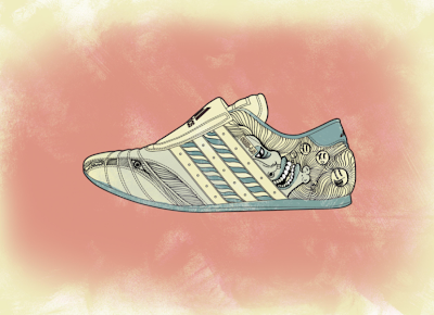
Foot Locker offered a ridiculous amount of money for entrants to colour in pictures of their shoes. Moreover, the winner gets their design on a real Foot Locker shoe. My designs are below.


Click this link and 'Like' any of the designs; whichever you find the most rad really. http://www.footlockerartprize.com/show/219771


Tuesday, May 3, 2011

The graphic novel begins...

Hey everyone,

Well I'm roughly six weeks into my honours degree and as some of you may know, I'm creating a graphic novel as my main project. The book will question the suburban culture of Melbourne; I'm really interested to find out what makes Melbourne what it is. Is it the Burlesque scene in South Yarra? The local footy team in Frankston? Our sense of gay pride though its still taboo? Though we push visitors to  marvel at our CBD, it's only the start of what characterizes Melbourne.

I've put together some character concepts below, let me know what you guys think.


Friday, March 4, 2011

Ship Tattoo

I was immortalized today. There is now someone out there with my artwork tattooed on them. Jacka, a fellow blogger (check it out here) asked me to illustrate a ship for him. So I did.


When I asked 'why a ship?', he explained that, for generations, the men in his family spent most of their lives out at sea. So I want to create something swashbuckling and a little bit epic. The inspiration for the linework came a bit from ILoveDust studio. It'd be so awesome to work with those guys. ILoveDust, if you're reading, I finish honours at the end of this year. Very open.


Tuesday, February 8, 2011

Comic Strip

My first big job for the year has involved working with brilliant comedian Asher Treleaven and delightful burlesque performer Gypsy Wood. Together they created their brainchild 'Comic Strip', an Adelaide Fringe show of raucous stand up comedy and glamorous burlesque. Naturally, I was honoured to be involved.

Both had solid ideas of what the posters should look like but were very open minded to my input which was great. Gypsy was kind enough to lend me her book titled 'Tivoli', the story of Melbourne's golden age of comedy and burlesque entertainment. The Tivoli theatre was Melbourne's prime entertainment hotspot through the 1910's and reigned supreme until the introduction of television and cinema. However, it left behind a rich archive of amazing posters and advertising, very similar to what's pictured below. (The book was too nice to sandwich into a scanner)


I loved everything from the cheesy taglines to the hand generated type and collage photos. Luckily was given a brilliant photo of Gypsy to work with. Within a week, I responded to the brief with the three options below (the comedians featured were placeholders):


We all agreed on the first one, there's no relationship quite like pink and blue. From there is was quite straightforward, we just worked on adding the additional event info and adjusting the imagery to balance nicely. Below is the final result, we're currently going through print production now.


Also, this is the new rendition for Comic Strip's Edinburgh premiere! Well done guys.


Take a shot if you see it around.

Happy New year!

Mete.